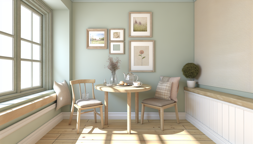
Weekend mornings feel better when the room looks soft and steady. Many cafés get this right with calm walls, warm wood, and a few well placed color notes. That same feeling can work in a small breakfast corner at home.
A good palette does not need many colors to feel complete. It needs a gentle base, one or two supporting shades, and a few textured details. With the right mix, the space can feel lived in yet still modern.
How to Steal a Café Calm
Café style usually looks simple, but it is built on clear choices. Start with a soothing base, then use art and texture for personality. Small changes often do more than a full room redo.
Why low contrast colors feel restful
This section explains the background colors that make cafés feel easy to sit in. It also shows how that same approach keeps a breakfast nook from feeling busy. In small rooms, low contrast choices can reduce visual noise.
Many 2024 coffee shop paint guides point to warm beige, soft gray, earthy green, and ocean blue as reliable calming picks. These low contrast walls feel cozy yet clean when paired with wood furniture and gentle lighting. A simple way to hold that calm is to add canvas art prints by Desenio above the table, then echo one shade in a towel.
Nature based palettes also show up again and again in café and home design. Sage, olive, mossy green, and sky blue work well with plants and natural woods, which helps guests linger. A matte finish can also help the palette read softer.
How light changes the same paint
This section focuses on sunlight, surfaces, and how color behaves through the day. It also covers a few newer neutrals that suit a breakfast corner. Even a neutral can shift cool or warm depending on the window.
From 2025 to 2026, color reporting keeps moving away from stark white toward complex neutrals like gray green and soft, sun washed beige. One widely shared example is a gray green entryway described as a calming neutral that pairs with wood and art. It can also look richer next to linen and small brass accents.
For a warm café glow, designers have praised Sherwin Williams Sunbleached as an airy backdrop that flatters layered textures. Homes & Gardens has noted that Sunbleached suits sunlit rooms and pairs with taupe, clay tones, and soft greens. It can also sit comfortably on walls, ceilings, or even cabinetry.
Using art and textiles for gentle contrast
This section shows how to add personality without losing calm. Consider studies on harmonious color to see how color and texture interact. The key is to keep colors grounded and let texture do part of the work, using tactile fabrics, layered rugs, woven throws and varied finishes to introduce depth without creating visual noise, and to achieve this aim pick one accent color and repeat it in small doses.
Some recent color stories treat pastels as sophisticated when balanced with deeper tones. A soft ash pink called Sweet Embrace has been compared to dawn clouds, and it works as an accent wall or upholstery shade. Pair it with coffee colored wood, white trim, gray blue accents, and greens like sage or dark pine for a fresh, grown up look.
Cafés often place personality in local artwork and handcrafted ceramics, not in loud wall colors. Texture supports that same idea at home, especially with mixed fabrics like bouclé, leather, and cotton. If the corner needs more color, trends like Earthy Vibrancy suggest ochres, mossy greens, clay pinks, and spicy browns with warm undertones.
A balanced nook feels inviting because nothing competes for attention. The walls stay quiet, and the details carry the story. Cool blues and greens often read calm in dining spaces. Warm reds, oranges, and yellows work best as small accents. Layer bouclé, washed cotton, tweed, or velvet, then add patterned ceramics for depth.
A small corner that slows time
Many homes have an unused patch of kitchen space that can become a daily retreat. A café style nook often uses a soft toned banquette, a small sculptural table, and one playful light. The goal is not to copy details, but to make the zone feel complete.
Start with a warm neutral or a gray green, then build out with one artwork and one textured textile. Repeat the wall color in two small details to keep the look cohesive. Keep bright warm tones to accents and balance them with cooler shades. A relaxed weekend morning often starts with a room that asks for nothing except time.


